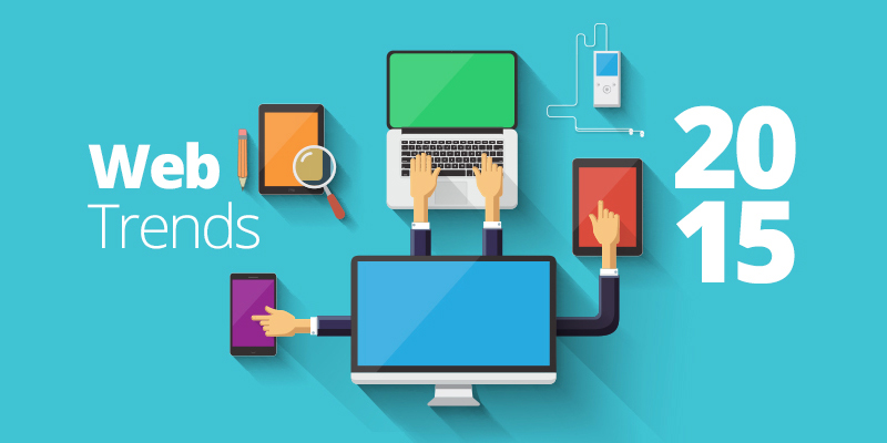
Here’s a look at what worked for web designers in 2015? Though there are some web trends that change every year, but most design patterns are here to stay in 2016. So you may find out if you’re missing out on anything.
Material design
Material design is an evolution of flat design, which focuses on clean design and minimal use of colour, shapes and typography. It makes use of shadow effects which adds depth to the design and brings out designs that appear more realistic. It adds a concept of movement and is a more modernistic design than the flat design, which focuses on user experience. The principles of flat design are combined with animation and gradients to provide a 3D effect. All this is done for enhancing the user experience by making it easier to use. This kind of design highly simplified the mobile layout in 2015.
Card layout
Card layout is a design where information is placed in big-sized rectangles (called cards) on the page for better scanning. Every card represents a different concept and speaks of a single point. The rectangular shape makes it easier to arrange them in different patterns. This is the best layout that allows the content to fit into different screen sizes including computer and mobile platforms. The card layout is a simple yet good-looking and neat design.
Above-the-fold concept
With scrolling becoming more common, the fold became irrelevant. Earlier, designers were bound to place all the important information at the top of the page. But now, long scrolling pages with full-screen image titles and pages filled with beautiful big images is in trend. Websites are expected to see designs that take up more space vertically.
Infographics
Infographics began becoming popular in 2014 and saw gaining prominence in 2015. It is a great way of combining text with images to make data, interaction and engagement with users more interesting.
Animation
Animations made a comeback! Seeing that flat designs are ending up looking too boring and consistent, web designers started bringing up GIF animations on their sites again, and it proved effective. Animation lets more information to be packed into lesser space. It is a way to story-tell what is on the site, making it more entertaining and interactive for the users. But, you can’t use animation anywhere and everywhere. You need to know which animation will prove better for your site and how you must use it. Loading animations, hover animations and motion animations were some of the most common animations used. You can also choose where you want your animations like in navigation, menus, galleries or background.
Fast loading
People are becoming impatient and want everything easier and faster. Internet users want their websites to load at lightning speed, or they would get annoyed. Users considered websites that are slow to load as websites that do not load at all. Users wait for 4 to 5 seconds for a page to load or else navigate away. So, it is important that you keep your design as simple and minimalistic as possible so that it loads faster.
What to expect in 2016
In 2015 we saw mobile use overtake desktop, but users haven’t caught up to this trend yet. Most users still believe a website should look good on their computer first and then think about the mobile. But in 2016 computer-only websites will look out-dated and unprofessional. As the mobile becomes the main device for browsing the web, “mobile-first” will be the most important aspect of web designing. So, make sure that you have a website that is easy to browse on both these platforms. You need to focus on responsive websites to have greater and better user experience. Simplicity is going to be the ‘mantra’ of website designing in the future. Whether you work with flat designs or material designs, you can use ghost buttons on your site, which will seamlessly merge with the site because of their transparency and yet attract the users’ attention. Animation will rise and be seen almost everywhere, although maintaining the simplicity. You can forget about pixels and above-the-fold concepts in 2016. With websites delivering app-like experiences, you will see the difference between the two almost disappearing soon.
Planning to design a website with the latest web design trends? Need the best design elements that blend well with your business type? If your answer to both these questions is yes, you can approach Jain Technosoft, a leading web development company in Bangalore, who has a team of web designing experts that has been designing websites for all types of local and international businesses.


