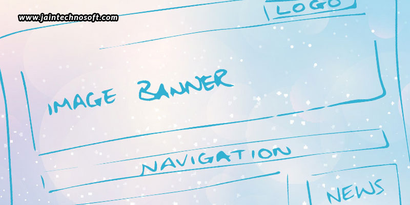
Designing your own website elements requires you to call on experts offering Web design services in Bangalore. Although you can totally rely on such expert designers, yet it is also necessary that you’re yourself aware of the important design elements too. This will help you understand and communicate better with them to bring out the outcome you’re willing to have. Today, in this blog, we’ll help you understand the most important design elements of a website header. After all, a website header is the first thing that catches the attention of a visitor. It thus needs to reflect your brand, which is what calls for strategic and creative thinking for designing a website header.
What elements to include?
Business name
Obviously, this is the first thing that you want to include, as your business name on your website header can strengthen your brand identity. The business name could be your company’s name, or if it’s a blogging site or online portfolio, it could be your own name or initials.
Logo
Next in line comes the logo, which is equally important as the name of your business. A logo is what gets stored in the memory of visitors, which they can easily recollect when they think of any related products or services in the future. You could place your logo right in the center of your website header, or on any one of the sides; there’s no standard way of putting it.
Navigation menu
A clean and understandable navigation menu is a must. You should create a neat list of all the items of your website, like the About Us page, Products page, Gallery page, Affiliations Page, Contact Us page, etc. Placing such elements on your website header can provide visitors with a straightforward website navigation, making it easier for them to find what they are searching about you, without having them to get confused or waste any time.
Search bar
Another way to make it easier for visitors to find what they are looking for is by including a search bar onto your page. Adding a search bar to your header can help visitors perform a search on your site, which displays a list of items connected to the query, thus making it easier and quicker to help them get where they want to.
Login
If a membership is what is required for your business, it is best to have your Login on your website header. This makes it easy to have visitors find where they can login and get the important information they’re looking for from you.
Languages
When you want to cater to different kinds of people, you could do it better by communicating with them in their own language to bring in the comfort level. And, if you’re planning to do so, its best to have the option of choosing the language in the header.
Shopping cart
When you’re selling products, you want to give visitors the option of adding items to their cart so that they can confirm their final orders, whether at the moment or in the future, in a better and more comfortable manner. Add the shopping cart to the header to simplify and improve your shopper’s checkout process.
How to make it better?
Use clear readable fonts
Readability is of utmost importance. The fonts your put up on your header should be easy to read. It should be the right topography style, size, and colour. The font your choose should certainly represent your brand identity and stand out, but that doesn’t mean you compromise on the readability.
Use the right colours
Colours are the best ways you can make an impression in the minds of the visitors. First and foremost, the colours should represent your business. For instance, if you are catering to a professional segment of people, the colours should be subtle and minimal. On the other hand, if you are catering to kids or the youth, you could opt for fancier and vibrant colours. In addition, the colours you use may be parallel to the colours in your logo, for that added effect. Whatever you do, the colours should make your brand, while also making it comfortable to read the text on the page, and also browse through the various elements you have put up on your header.
Use the right header style
There are multiple ways in which you can style your header.
- The most basic standard style is the fixed header, which stays pinned to the top of each website page, so that users see it wherever they go. This gives visitors easy access to information at all times, providing an outstanding navigation experience.
- Next comes the hidden navigation, which is represented by an icon consisting of three horizontal lines, stacked one on top of the other, which includes the entire navigation menu, but keeps it hidden from view, to expand the area for viewing other elements on the page.
- Lastly, there is the shrinking header, which dissolves into the website’s background as a user scrolls down. It wont be seen at all times, but it’ll still be there.
With these few tips, and with assistance from professionals offering Web design services in Bangalore, you’re sure to have a great header design, thus impacting the overall impression of your brand!


