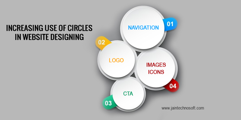
Web designs are evolving each day. Web developers are seeing constant renewal as well as innovation taking place in the sphere of website design. Today squares and boxes have given way to circles in web designing. Based on the comfort with which one can use CSS to create circles, we are sure that circles are here to stay for a while now.
In this post we will discuss ways in which you can use circles in order improve your website’s appearance and also help it function in a better way.
Navigation
When it comes to navigation, using circles has become one of most popular choices today. Today’s evolving and growing market favors mobility and this is why circles have come out as the most logical choice for navigation. Also with the increased use of touch screen devices, using a circle instead of button easily connects with the user. It in fact also mimics the shape of a fingertip which cajoles the users to press it.
Logo
Not only does a circular logo give a neat and minimalist look to your website, but it also gives a feel of class and sophistication. This is why, most web designers, today prefer using circular logo. A circle, in fact is one of the oldest symbols known to mankind – it is often used to represent life itself. This fact also is responsible for circle being a popular choice for logos these days.
Image Previews
Round images are usually aesthetically more appealing to the users, and this is the major reason why we recommend it for image previews. In fact it is seen widely in portfolios around the web. Presenting your previews in an intelligently cropped circle visually directs the user as well as communicates directly to them. Also circular images does not give a cluttered look to the website, rather it is commonly seen that websites with circular image previews give the website a creative and harmonious look.
Icons
Circular icons are the most popular circular element used in web design. This is due to the fact that circular icons are images based, so CSS capabilities do not have to play a role in its use. There are web developers who feel that as it has been a while that circular icons are decorating their web, it is time to change the design and move in a different direction. But the fact that circular icons are aesthetically more appealing also is a proof of why one must stick to circular icons for the time being.
Calls to Action
Call to action (CTA) is a very important feature for every website. It is essential that you put your call to action in such a way that it actually attracts the users and leads them to convert into your customer. Round patterns serve very well as call to action tool. It must be noted that in case you use circles for navigation as well as CTA, it is essential that you distinguish between the both. Call to action, undoubtedly should be the priority element and needs to be treated that way. Most web designers are good at creating a visual hierarchy, and this point is nothing but just an extension of it.
We are sure if you follow these tips and use the circle in an intelligent manner, you will surely get an appealing and highly impactful website design for your business.


