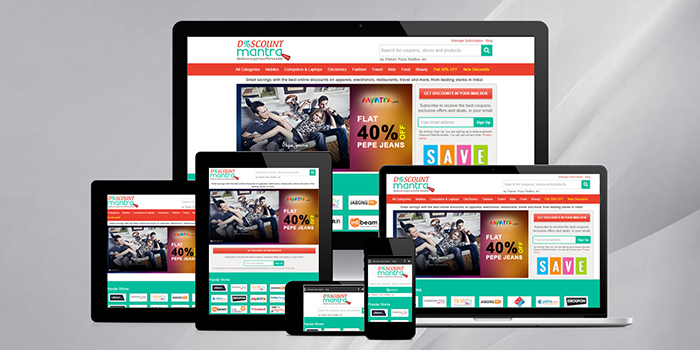
Responsive Web Design (RWD) is the process to design a web page in such a manner that the end user gets an optimal viewing experience on all the viewing devices – right from desktop computer monitors to mobile phones. Easy reading and smooth navigation with minimum scrolling, resizing and panning are the main features of optimal viewing.
With the increase in the use of mobile phones and “phablets”, it has become critical that the websites are designed in such a manner that the layout changes according to the user’s screen resolution. It is here that RWD plays a major role. It allows for an advanced 4 column layout 1292 pixels wide, on a 1025 width screen, which auto-simplifies into 2 columns. Along with this, RWD aptly fixes on the smartphone and computer tablet screen.
These days the number of responsive web design patterns is growing. Yet there are some select customary patterns which work great on desktop as well as on mobile devices. The layouts used by responsive web pages can be categorized as one of the follows:
- Mostly Fluid
This pattern mainly consists of a fluid grid. It remains the same on large or medium screens, while on small screens the fluid grid triggers the main content to reflow, thereby stacking the columns vertically. A major benefit of this pattern is that it usually requires one breakpoint between large screens and small screens.
- Layout Shifter
Regarded as the most responsive pattern, Layout Shifter provides multiple breakpoints across several screen widths. The most important feature of this pattern is the way it allows content to move about instead of just reflowing and dropping below other columns. As there are major differences between each breakpoint, this pattern is more complex to maintain.
- Column Drop
When it comes to full-width multi-column layouts, this pattern simply stacks the columns vertically as the window width becomes too narrow for the content. This results in all of the columns being stacked vertically. The content and design usually decide the breakpoints in Column Drop design.
- Off Canvas
Instead of stacking content vertically, this pattern places less frequently used content off screen, showing it only when the screen size is large enough, and when the content is only a click away on small screens.
- Tiny Tweaks
As the name implies – Tiny Tweaks simply makes small changes to the layout – like resizing images, adjusting font size, or moving content around in very minor ways. This pattern is best suited for single column layouts such as one page linear websites, text heavy articles etc.
There are also instances when a page may be developed using a combination of these patterns. All these patterns provide a concrete starting point to every responsive page.
Thus in a nutshell – Responsive Web Designs
- Respond to their environment
- Have fixed width for medium and large screens and fluid width for small screens
- Adaptive to multiple fluid grid layouts
They are therefore geared towards bringing a fundamental shift in the process of website building in the coming years. In order to stay at the forefront, it is highly recommended that you too adopt RWDs for your websites. Professional web designers can help you with a strategy to convert your traditionally web designed websites into RWDs.
We, at Jain Technosoft are dedicated to providing the best and latest web designs powered by innovation and cutting edge technology. Get in touch with us to know how your website can benefit from the expertise of our experienced web designers.


