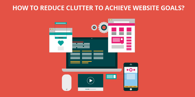
 While designing websites, what we need to keep in mind is to create one that gets a message across to the audience. And to get a message clearly across, the website should be clean, clear and highlighting the most important aspects. If the website is too busy or cluttered, it will shoo away the visitors almost immediately. Almost 30% of visitors immediately abandon a website if they find it too cluttered because it tends them to feel anxious. So, getting rid of clutter is the most important aspect for every website designer. You obviously won’t want to get your audience anxious and frustrated but, you also may not realize that your website is disturbing them. So, how would you know if your website is cluttered?
How to check if your website is cluttered?
The most preferred method for checking if your website is cluttered or not is through user testing, which involves getting feedback from people. If people tell you that your website is cluttered or busy or that it is hard to find information amidst too many elements, you should be sure that you need to take steps to resolve the issue immediately. But, you must remember that this method is expensive and time consuming.
Another method is the Five Second Test, where testers will be shown your website for only five seconds after which they will have to answer some questions where they will need to recall what they just saw on the page. If you don’t get positive answers from them, you can be sure that your website appears too cluttered. Had your website had some breathing space, the testers would definitely be able to recall some, if not all of the elements on the page.
Another option is the Clutter Test, where an algorithm is used to measure the amount of clutter on a page. Anything below 50% in this test is good enough.
How to prevent clutter?
If you have hired the best website design company, you need not worry about taking the pains to de-clutter your website because they will know how to do it well. However, if you want to redesign your website on your own for a de-cluttered version, here are some tips:
First of all, remove all those items that are of no use to your visitors and those that don’t bring you any kind of profit. Cut out everything that doesn’t help you achieve your goal. The latest concept of web design is minimalism, meaning less is more, and you must try your best to stick to it.
Now, with what remains, prioritize the elements as per their importance – may it be based on the utility they provide to the visitors or the profitability they bring to you. Hide all the less important items but, make sure they are discoverable through further navigation.
Don’t try to give the visitors a lot of information on a single page. You definitely want to highlight your important elements but, instead of putting them all on a single page, separate them into different categories and create different pages for them. Remember to set a goal for every page and make sure that every page is accessible from every other page through well-organized navigational menus and site maps.
Highlight the most important elements on a page with a different colour or font size or by bolding the words. But remember, everything in bold is no more bold, meaning that instead of highlighting every important element, select only the most essential elements to be highlighted.


