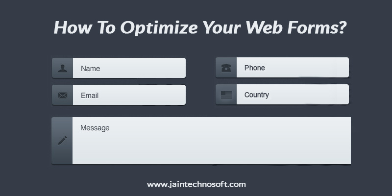
People optimize everything on their website but generally ignore the forms. They forget that forms are an important part of a website – may it be a contact form, survey form, registration form, request a quote form or an order form. Every form needs to be optimized differently in order to get better conversions. No matter what kind of a form your website has, it must be simple, short and understandable to increase the response rates. Here are the general points you should keep in mind while create any kind of web form.
- Don’t ask for unnecessary information. Just because everyone else asks for the user’s contact information, it is not necessary that you ask for it too. Ask for personal information only if necessary. Let the users feel that they have privacy while communicating with you.
- Make your call-to-action buttons clearly visible and easy to identify. If the buttons are not easily findable, the whole process of filling the form will fail and generate a loss.
- There are mistakes that users make while filling a form. But, it gets very annoying for them if you let them know of the errors once they have filled out the entire form and hit the send button. It becomes very troublesome for them to refill the form by correcting the mistakes. In fact, you should let the errors appear as and when the users make any mistake so that they can rectify it there and then.
- Also, if the users are making any mistake, don’t just tell them it is an error. In fact, tell them what their mistake is so that they don’t repeat the same mistake again and again.
- Don’t clear existing fields if there are errors. There are some websites that makes users fill the entire form and when they click the submit button, it asks them to rectify their errors but, entirely clears the fields that contain errors. Don’t do this. This becomes frustrating for the users. Let the errors be as it is for them to see and understand why your website marked them as errors.
- You must label your fields clearly in order to make the user understand why you are asking for the information or what you exactly want. For example, near the password tab, you can specify how long you want it to be or for an email option, you can specify what this email information will be used for.
- Use cookies to remember user passwords. People might be having too many passwords to remember. So, you can make it easy for returning users by remembering their password and other details. This will save the user’s time.
- Make the form filling process as easy as possible for the users. You can include drop-down menus for the tabs in your forms to make it easier to just select the information from the menu rather than typing full words. You can also include tick boxes so that it would have less work for users to do.
- The most important point for creating any kind of form is that you use the correct voice quality. Obviously, your form won’t speak but the words you use and the way your form interacts with the users will speak of your class. Make the users feel comfortable to share their information with you.
For any kind of help that you need in order to create or improve on your web forms, you can approach Jain Technosoft, one of the leading web designing and web development companies in Bangalore. They will help you create an entire website that is well-optimized to increase traffic and conversions.


