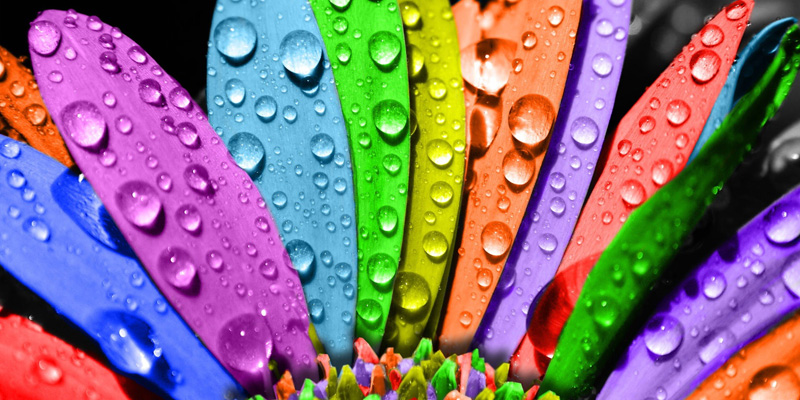
Do you know that colours play a very important role in every walk of life? Remember the black and white era that we see in the movies? How would you feel if everything around you was only in black, white and grey? You get a dull feeling, right? This is the reason colours are important.
Colours in a website are also important as they affect the frequency of conversions. The colours on a website help users connect with different emotions, which results in them navigating away or transforming into conversions. So, be very careful about using colours in the background, text, borders, headlines, web banners, pop-ups and calls-to-action buttons.
What do particular colours depict?
You need to find the colours that express what your company and products stand for. But, how would you know which colour to use for your brand and website? Here are a few common colours listed along with the kind of emotions they can trigger. Read and find out which colours could be the most useful to you.
- Red is the colour that grabs the most attention. But, too much of red on your site will prove to be disturbing and will not bring a positive effect. You can use it at minimal places where you want to draw the users’ attention like for calls-to-action.
- Yellow is bright and lively, thus clearing a user’s mind of depressing thoughts. It brings a healthy feel to the users. So, this colour can be used in websites related to kids or medical products.
- Blue is cool and calming. It also provokes a feeling of trust. This is the reason why the logos of Facebook, Twitter and LinkedIn are blue. Or did you think it was just a coincidence? If you are catering to something that demands reliability and faith, blue is the colour you must use.
- Green signifies nature and peace. If you are catering to natural products or environmental services, use green in your website.
- Orange stands for sophistication and finesse. Consider this colour if you are a technology based company or you are dealing with high-tech gadgets.
- Pink symbolizes femininity. For any products or services related to women, use shades of pink to instill emotions of fun and attachment. Since pink can mean a variety of shades, be sure to choose the perfect shade or tint for your site.
- Purple is the colour of royalty and elegance. If you cater to luxurious products and target the high-end audience, use purple.
How important are brightness and contrast in comparison to colours?

You have chosen the right colour palette for your website. But, this is not enough. You also need to know what amount of brightness and contrast you need on your site to make the colours play well. A research has shown that women prefer soft colours, while men prefer brighter and bold colours. But, women while shopping for their kids, will prefer brighter colours. So, you must know what audience you are targeting, and thus decide on the brightness and contrast of the colours you want on your site.
Impact of colours in different cultures
Apart from all the above mentioned points, also remember that colours vary with different cultures. A single colour may bring positive results in one culture, while may prove negative for the other. For example, white is considered a happy colour for Christians, which is why they wear it for their weddings. But, the same colour is used for death ceremonies in Hindus. Thus, you need to be very careful while choosing colours depending on what audience you are catering.
If you are still very confused as to what colours and combinations you want to use for your brand, just get in touch with Jain Technosoft, a leading web design company in Bangalore, who have been working for a large number of local as well as international clients, and have great knowledge of the design and colour that should be used for a particular website and brand, to bring great success.


