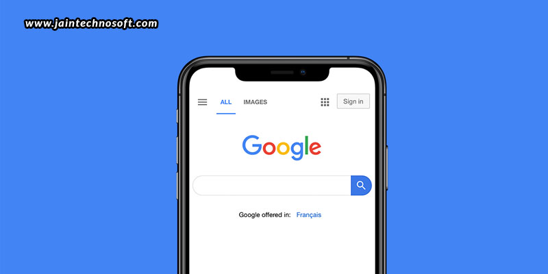
Google has recently announced a major design change for mobile search results. It has replaced the greed Ads indicator with black bold text. What we need to consider with this change is if Google has gone too far. Does this change blend ads and organic results? Well, the previous change was that Google had matched the colour of the Ad marker to the display URL, substituting a thin round rectangle for the new bold text. This change does not make the latest change look like a huge shift.
But, when we look at it from an organic point of view, unlike some previous ad designs, this change arrived with a redesign of organic results. While fonts and sizing and the surrounding UI have changed over the years, the core placement of the display title, display URL, and snippet have been the same. There is also a small version of the site’s favicon in the new format. Google also now shows the brand name when available. But, this brand name logo in black and white poses a problem for brands. At times, the size is small, hard to distinguish from the “Ad” text, or has a problem with the resolution. This definitely impacts click-through rates for smaller brands. For well-known brands, this may not pose a problem, as big brand names are practically recognizable.
With this update, marketers have been quick to brainstorm ideas to update their favicon. But, Google is smart enough to push back on manipulating favicons. Manipulative, inappropriate, and constantly changing favicons will definitely be removed. However, if you don’t have a favicon at all, Google will serve up as a default. While it won’t be too bad, but it is always better that you have a favicon that matches your branding. The most recommended favicon is suggested to be at 48×48 pixels. You can use from the many free tools available on the web to convert standard graphics formats to a favicon file (.ico). It is so easy to make a favicon that subjectively, most people are reporting favicons being updated in a day or less.
With all of the above, the next consideration is if Google’s future is brand-first. By moving the brand or domain to the first line and adding a favicon, the new design reflects a brand-first approach – an emphasis of brand and site over specific content.With the new design, it is now clear that all the elements of organic result, site links, and blog posts are all tied to a single source. Taking a brand-first approach may also be a part of Google’s larger strategy to fight false information, and help searchers assign content to its source.
However, we don’t know how long these changes may last. But, like most of the major design shifts, we can only assume that Google has been testing the change for a while, but if the favicons are manipulated to the point that automation can’t handle the problem, they may have to change course. With the changes currently in line, you must approach a PPC services company in Bangalore to help you tackle it; to help you know if your favicon accurately reflects your brand and doesn’t look too similar to the black “Ad” text. Taking care will help you positively represent your brand and drive relevant clicks with your organic listings.
ALSO READ: What to do when a Google algorithm update comes up?


