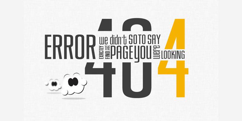
When visitors to a site get 404 error page, there are high chances that will not only get confused, but also frustrated and leave your website for other alternatives. This is obviously not what any web designer wants. In this blog post, we will show you ways in which you can change this adverse situation to the advantage of your website.
Follow the below given tips to create custom 404 error pages which will send a positive message to the visitors to your page – that you are with them, even when your content can not be.
Keep your page branded
This means your 404 page should make it clear that the visitor is still on the website. You can do this by keeping your custom 404 error page within the template of your website (along with standard top and footer navigation), or you can just build a custom 404 page outside your standard template. Logos do make a lot of difference – Trust us on this.
And by keeping the 404 error page on-brand, we mean each and every word which you use should accurately represent the personality as well as the tone of your brand. Suppose you have a news website, then it will be sensible to keep your messaging straightforward and very professional. On the other hand if the tone of your website is conversational then you can use 404 page as an ice-breaker joke and connect with your visitor. So the tone of your 404 page totally depends on your brand voice. You need to stick to it always.
Acknowledge the Error
This is very important. The visitors to your page cannot view the page – thus you need to make them understand why this is happening. Now how you are going to communicate again depends on your very own spin. But what is important is that there was an error and that for some reason or another, the page they are looking for cannot be found. Acknowledging the error, does help in bringing down the confusion of your visitor.
Prevent the Back Button and display your brand identity
One thing which is natural is that once a visitor is dished up a 404 page they are sure to be surprised. They were looking for something else and they get to see something totally different. Now let us accept this that this situation is inevitable. But it is up to your web developers if they want the visitor to be pleasingly surprised or just leave out as annoyed surprised. In fact, you must choose a web design which will exploit the occurrence of 404 page in an excellent manner.
You can either use an on-brand image to visually engage the visitor or use the body copy and headlines to add a human touch to the page, or much better pop up a funny/ humorous image on the page.
Along with the above given points, always try to do the best you can to serve your visitor. As is the popular dictum, “focus on the user and all else will follow”. Therefore always gear your 404 error page towards other goods and services which you offer, rather than letting your visitor choose an alternative website. You can tweak your web design in such a fashion that you tell them what you want them to do.
Always keep in mind that 404 errors are ought to happen – URLs are mistyped, pages are removed, moved or even broken. Thus it is crucial that your web development team is always proactive in its outlook and come up with customized solutions for your websites.


