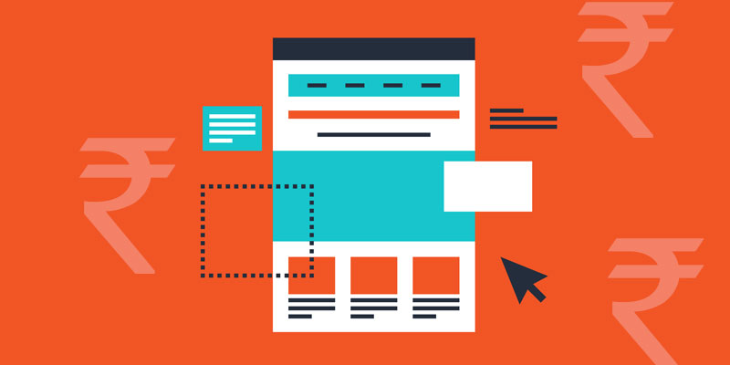
Landing pages play a very important role in capturing the interest of potential customers and generating targeted leads, ultimately generating a good amount of revenue for your business; but only if done right! Remember that a poorly designed landing page can cost you a lot. You are paying to get visitors to land on your landing page, and if you aren’t able to fetch good amount of conversions, you are hurting your business. This is why you need to design and optimize your landing pages to the best with the help of professional SEO services in Bangalore to push your conversion rate higher. Listed below are some of the best landing page optimization practices that you may use.
Keep out the clutter
You must cut out all the clutter, and have a clean and tidy landing page. You must have a background colour or pattern that highlights all the elements on the landing page. Also, you must keep only the most important elements on your page. Instead of cluttering up your landing page with too much information, provide only as much is important for the visitors to make an informed decision.
Include sufficient white space
A clean landing page with enough breathing space between different elements is what you require. Once you have decided upon your background colour/pattern, and the elements you wish to include, you also need to focus upon the amount of white space you put in between all the elements. You must provide adequate amount of white space between each element so that the visitors can easily distinguish and concentrate on every element, without being distracted by another at the same time. A clean layout minimizes confusion, eliminates distraction, provides a clear message, and encourages more interaction.
Create ideal CTAs
CTAs are the most important elements of a landing page. They are the most prominent and highlighted buttons on a page. They are the ones majorly responsible for the difference between bounce rates and conversion rates, which is why you need to craft the perfect CTAs for your landing pages. First of all, you must remember that there should ideally be only one CTA on a single landing page to avoid confusion and distraction. You must design that CTA button keeping in mind the goal you wish to accomplish with your page. Accordingly, use an appropriate text for your CTA. Make sure you use text that clearly tells the users what will happen when they click on the button. Use words that appeal to the users, and colours that make your CTA stand out from the rest of the page.
Use appropriate images
We all know how images can grab the attention of visitors more than text. An image can captivate the visitors and evoke emotions that can influence decisions. Therefore, you must put up images that evoke positive emotions within the visitors so that they can take a decision that is in your favour. However, you must remember that the images you use should not fade away from the message you want to give to your visitors. Choose an image that highlights and strengthens your core message, and make sure the image is clean and easy to understand. Avoid low-quality images and stock images. Instead, use customized images that are unique to your landing page. Also, optimize your images so that they load faster, while maintaining quality.
Include social proof
When humans have to make a choice between a few things, they are likely to choose the one that is already acknowledged and trusted by others. To have your landing page bring in the trust of more and more customers, you must show social proof of your acceptance. These may include Facebook fans, YouTube subscribers, Twitter followers, Instagram followers, newspaper/magazine/website featuring, etc. You can also add the logos of your remarkable clients on your page. All of this can instantly make you trustworthy, and can help increase conversions.


