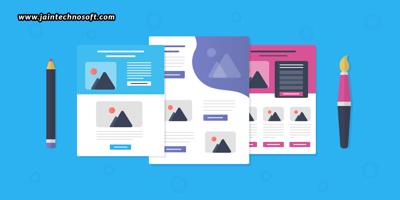
When you’re putting in all efforts and a lot of money into advertising, and yet not being able to catch the number of leads you expect, there may be a problem somewhere on your landing page. Is your landing page optimized? Is it designed for conversion? Probably not. And, this is why you aren’t getting the expected leads. Here are a few tips you can easily apply to your landing pages to make them work just like you want them to.
Create your landing page relevant to the ad you are posting
People will generally get onto your landing page through clicking on your ads. But, when will they click your ad? When they find the ad relative to what they are looking for. But, what if they click on your ad only to find that your landing page is not exactly what they were looking for? They’ll quickly jump off your page, and probably on to your competitor’s. In order to prevent users from doing that, you need to take care that you need to have a strong message match between your ads and your landing page. What we mean to say is that you need to create landing pages with content that matches what you say in your ads. If the content in both are different, the users are likely to bounce off.
Have only the most essential information on your landing page
You may have a lot of information to give to the viewers; we understand that. But, not every visitor may want all of that. It is thus important that you first provide only the most relevant and essential information, and leave the remaining for later. Crowding too much information into a single page can forgo readability and risk overwhelming a potential customer with too much information, thus leading them to lose interest. What you can do instead is highlight only the most important information at the top of your landing page, and leave further details below. This way, you are giving customers enough information to have them assured that they are at the right place, and if they need any details, they can always scroll below or deeper into other pages.
Develop a good and appealing design
How do you plan on buying something? The first thing you look for is appeal, isn’t it? When something “looks” good, you then go further into looking into other aspects like the sizes, the colours, the fits, etc. If something doesn’t appeal to your eyes in the first place, you discard it at once! Same is the case with the landing page too. You need to give a good first impression, for which you need to have a beautifully designed landing page with an appealing layout, thoughtful design, pleasing colours, and comfortable fonts. Moreover, your landing page must be responsive so as to look appealing on any kind of device and screen size.
Localize your landing pages
The most basic layout we all prefer using is a short and concise landing page written in English. But, do you know that this doesn’t always work out!? When you want to expand your business to a new country like Japan or China, there are different norms. Not everyone finds English comfortable; and not everyone wants a short and concise page. Different countries, different cultures, and different audiences have different preferences. Even today, there are certain regions and countries who prefer reading a website in their own native language, and want a page that provides all the information together. So, if you want a landing page to target a specific kind of audience or country, rather than a basic audience, you need to understand the kind of landing page layout and style they would feel comfortable with, and provide them with the same. Such localization can help you serve your markets better and capture leads more effectively.
Highlight your call-to-action buttons
Last but not the least, you need to compel the visitors to take the action you want them to. While many visitors know what they want to do next, there are others who need to be prompted. For this, you must always emphasize on your call-to-action. Have a highlighted Call-to-action button, neatly positioned where a visitor’s eyes can easily focus on, clearly telling them what to do, like “Buy”, “Subscribe”, “Create an account”, etc. Such distinct and compelling call-to-action buttons can convince potential customers to convert.
If your landing pages are not convincingly transforming visitors into leads or customers, you are certainly missing out on one or more of the above points. Give these tips a try, and see how you can improve your conversion rate! Take some time to optimize your landing pages, and you’ll reap the expected results. You may do it on your own, or hire the best SEO services in Bangalore to help.


