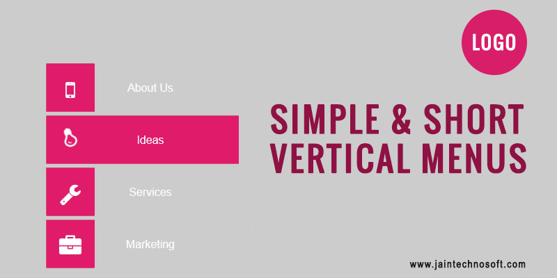
Whether you are a novice at web designer or a professional one, vertical website menus is one of the most exciting areas to explore and innovate. Designing vertical website menus is surely not an easy task, and a small error is enough to bring down the whole layout of your website.
Here are some amazingly useful tips which will make designing vertical website menus easier and fun for you. You can always add your own insight and personal touch to these tips and build great vertical website menus. So, here are the tips:
Single Page Layouts
One of the most flexible layouts, single page layouts does not always want a long list of links. You can link the content section from the navigation and yet your website will do fine without sliding panels as well as large dropdown menus. You can always include some exciting features to your web design, though vertical navigation does not require any tacky or loud features to draw the attention of the users.
Simple and Short

Whenever you opt for vertical navigation you should keep in mind that you tailor the content in such a way it includes all the information and is yet not very long. You can do this by resizing the fonts used on your web page as well as removing elements/ features which add very little to the web content and design of your website.
When you are tailoring the content of your web page, do not forget that small basic links perform far better than lengthy, descriptive texts. Thus it is recommended that you give all the important information to the visitors to your website, at the same time do not stuff your web page with unnecessary details.
Sliding Drawer Navigation
Responsive web design is the rule of the day! You can turn your vertical website menus into responsive designs by diligently using the sliding drawer navigation. One major advantage of this feature is that it opens at the same height and width, and thus is easily accessible regardless of the screen size, making it the best choice for mobile browsers as well as desktop browsers. At the end of the day, a responsive web design is one which can easily render expandable HTML/CSS websites and can be viewed easily on various platforms.
Single Column Menu
There are several websites which cannot function on single page layout. And if your website too has trouble in operating on single column menu, then you can opt for single column menu. You just have to place the vertical navigation at the top of the page and allow it to blend with the header.
Whenever you choose a single column menu keep in mind to have text which is easily readable and stands out for the user to get a better experience. Apart from opting for the right positioning and composition, using a sensible color scheme will go a long way in adding an edge to the layout of your website.
Thus contrary to popular conception vertical navigation, if used in the right manner, can work wonders for your web design. It can surely attract the visitors to your website and can help in better conversion rates and improved ROI.


